Usability UX of torture in the laboratories of the University
the ITMO UNIVERSITY, where I study in a magistracy, as it turned out, working usability laboratory. We are with like-minded people create a service to communicate and collaborate on documents Rizzoma. I got the idea to test our project.
In this report, we want to share the experience of conducting such testing, to talk about what we can expect from him, and to show what practical result we managed to achieve. I hope that this article will contribute to the emergence of new laboratories. For example, I'm very pleased with the appearance of such laboratorii we have in Tomsk.
It is known that in order to make a good interface, need to be in the shoes of the user. Total surveillance of the subjects, implemented in the laboratory, allows maximally to approach that. The key difference between the lab from home is the ability to track the direction of gaze by the method of Eye tracking. It is significant that the total value of equipment installed in the laboratory is of the order of 5 million rubles, of which 3 million is Eye tracker.
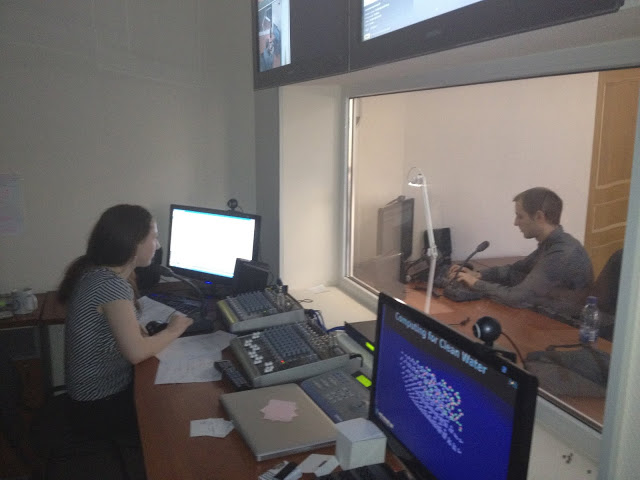
For the subjects can be observed through a one-way mirror Gazella, and you can follow the stream of three cameras. Also recorded video signal the place of the mouse position (mouse tracking).
A well configured hardware for voice conversation between rooms. But the sound recording was done very poorly because of this problem our video very boring to watch. In the laboratory received our feedback and said that now the issue has been resolved. With the organization of the testing helped us Sophia cabanova, head of the laboratory.
To test you need to prepare in advance to think through user scenarios. This moment we, unfortunately, worked not enough. I had to invent on the fly. In a few minutes we have thrown here:
1. To perform a login (register) in Rizzoma
2. Create a new document and a list of 3-4 points
3. To give each access to the document via email
4. Send your friend a message using the "@ mention"
Experienced user of Rizzoma to perform all these steps takes 3 minutes. We estimate that for beginners it takes less than 20 minutes.
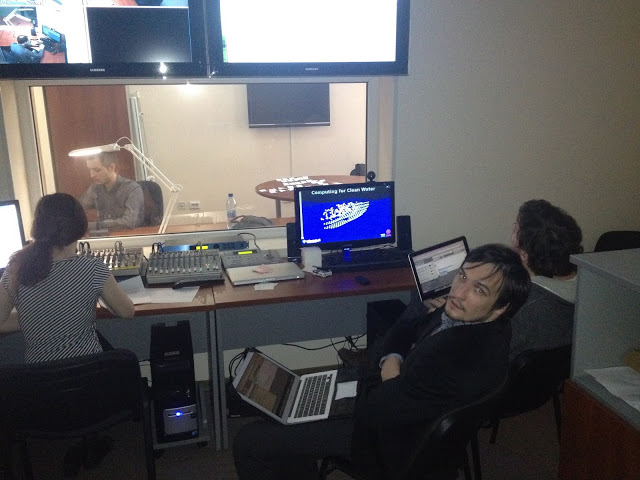
We explained that participation in the usability testing may be stressful for the subjects. Cause of stress is fear, the same fear of public speaking. The subjects I have personally vytseplyat in the corridors. All of them are somehow connected to IT and the startups, the students of ITMO, the staff of the business incubator Quattour Dimensionis (QD).
Sonia met subjects were told that nothing bad will happen, and otherwise soothed. Then they were placed in a relatively relaxing environment: on test sent three cameras in front of him is a huge mirror, which is known that it is transparent. In my opinion, really was relaxing and calmed by a quiet and friendly voice of Sophia from the speakers.
Setup Eye-tracker was done quickly, about 10 seconds. Sound check, another 10 seconds and then work with our site. During testing we were hiding behind the mirror in a small room. The basic concept of interaction, which adheres to the moderator test: the Respondent is given the task to do anything with the product, and then leave the Respondent alone to act impulsively, i.e., how it acts in real life, not rationalizing every action. When the Respondent to cope with the task, please explain why you have done so.
With the duration of the test match, on average, the experiment lasted 15 minutes. After the experiment we went out and talked to the subjects. Each chocolate bar: girls Bounty boys — Mars, in strict accordance with the recommendations of the marketers.
At the time of testing, our service was already active users and their number is growing steadily. Google Analytics data indicate that the conversion is kept at a normal level. For us was the discovery that the path from visiting the main page to work with document had some very serious "holes". Such that without hints from other users of the dive in service, strictly speaking, it was simply impossible. Apparently, we didn't see them in Google Analytics, since a substantial part of the new users are coming in search of alternatives to Google Wave which they used before, so the Rizzoma interface for them was largely familiar.
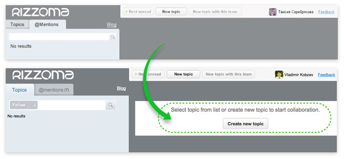
From the test results we made a bunch of small details that need to be corrected. Here is an example of how we solved the problem of frustration when you first open the interface. We quickly made a small patch, now the picture of the new polzovatelya not so frighteningly empty.
In addition, the testing helped to solve all the minor flaws in the concept of the new interface which we plan to update in early June.

Album with other parts of the interface (updated).
In the course of development of this version of the interface, we encountered an interesting moment. Development and rendering of the user interface was comparable in complexity with alteration of software code for this interface.
But as for us it is important to run this interface as quickly as possible, many complicated and controversial issues we postponed until. Here are some of them:
the
In the next couple of months we plan all of these issues to decide and more time to try out the service in a usability laboratory.
Article based on information from habrahabr.ru
In this report, we want to share the experience of conducting such testing, to talk about what we can expect from him, and to show what practical result we managed to achieve. I hope that this article will contribute to the emergence of new laboratories. For example, I'm very pleased with the appearance of such laboratorii we have in Tomsk.
the UX Lab: how does the spying on users
It is known that in order to make a good interface, need to be in the shoes of the user. Total surveillance of the subjects, implemented in the laboratory, allows maximally to approach that. The key difference between the lab from home is the ability to track the direction of gaze by the method of Eye tracking. It is significant that the total value of equipment installed in the laboratory is of the order of 5 million rubles, of which 3 million is Eye tracker.

For the subjects can be observed through a one-way mirror Gazella, and you can follow the stream of three cameras. Also recorded video signal the place of the mouse position (mouse tracking).
A well configured hardware for voice conversation between rooms. But the sound recording was done very poorly because of this problem our video very boring to watch. In the laboratory received our feedback and said that now the issue has been resolved. With the organization of the testing helped us Sophia cabanova, head of the laboratory.
Setting up experiments and user scenarios
To test you need to prepare in advance to think through user scenarios. This moment we, unfortunately, worked not enough. I had to invent on the fly. In a few minutes we have thrown here:
1. To perform a login (register) in Rizzoma
2. Create a new document and a list of 3-4 points
3. To give each access to the document via email
4. Send your friend a message using the "@ mention"
Experienced user of Rizzoma to perform all these steps takes 3 minutes. We estimate that for beginners it takes less than 20 minutes.

We explained that participation in the usability testing may be stressful for the subjects. Cause of stress is fear, the same fear of public speaking. The subjects I have personally vytseplyat in the corridors. All of them are somehow connected to IT and the startups, the students of ITMO, the staff of the business incubator Quattour Dimensionis (QD).
Sonia met subjects were told that nothing bad will happen, and otherwise soothed. Then they were placed in a relatively relaxing environment: on test sent three cameras in front of him is a huge mirror, which is known that it is transparent. In my opinion, really was relaxing and calmed by a quiet and friendly voice of Sophia from the speakers.
Setup Eye-tracker was done quickly, about 10 seconds. Sound check, another 10 seconds and then work with our site. During testing we were hiding behind the mirror in a small room. The basic concept of interaction, which adheres to the moderator test: the Respondent is given the task to do anything with the product, and then leave the Respondent alone to act impulsively, i.e., how it acts in real life, not rationalizing every action. When the Respondent to cope with the task, please explain why you have done so.
With the duration of the test match, on average, the experiment lasted 15 minutes. After the experiment we went out and talked to the subjects. Each chocolate bar: girls Bounty boys — Mars, in strict accordance with the recommendations of the marketers.
Conclusion: to fix the schools and conduct another test
At the time of testing, our service was already active users and their number is growing steadily. Google Analytics data indicate that the conversion is kept at a normal level. For us was the discovery that the path from visiting the main page to work with document had some very serious "holes". Such that without hints from other users of the dive in service, strictly speaking, it was simply impossible. Apparently, we didn't see them in Google Analytics, since a substantial part of the new users are coming in search of alternatives to Google Wave which they used before, so the Rizzoma interface for them was largely familiar.
From the test results we made a bunch of small details that need to be corrected. Here is an example of how we solved the problem of frustration when you first open the interface. We quickly made a small patch, now the picture of the new polzovatelya not so frighteningly empty.

In addition, the testing helped to solve all the minor flaws in the concept of the new interface which we plan to update in early June.

Album with other parts of the interface (updated).
In the course of development of this version of the interface, we encountered an interesting moment. Development and rendering of the user interface was comparable in complexity with alteration of software code for this interface.
But as for us it is important to run this interface as quickly as possible, many complicated and controversial issues we postponed until. Here are some of them:
the
-
the
- Where to place the button insert review so that a new user is it easily found? the
- Where to position the messages menu: at the top or bottom of the message? the
- How to make a/to generate/display new message appearing when you click "Reply". Make it so that it easier for users to communicate in the chat mode and, if necessary, to structure the useful information obtained in the communication process.
In the next couple of months we plan all of these issues to decide and more time to try out the service in a usability laboratory.
Комментарии
Отправить комментарий