The redesign of the Titan Quest for smartphones and tablets
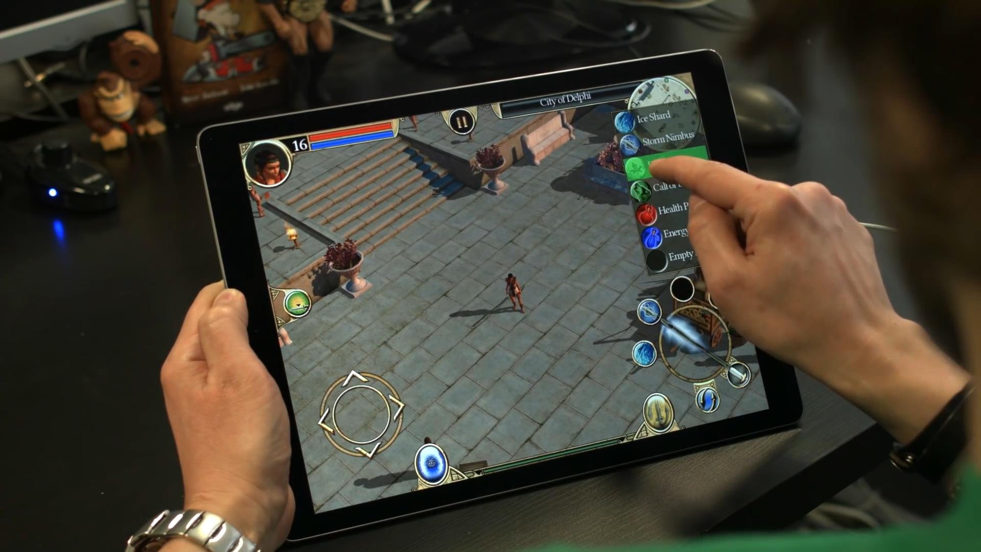
How to adapt the classics of the genre hack'n'slash, the game of Titan Quest, beloved by a whole generation of computer players, smartphones and tablets? I recently came to DotEmu and this was the question I needed to answer. But it wasn't just a question, it was a challenge that required nearly 20 months of speculation, iteration and development to properly "reset" a stunning game for its army of fans!
All had to (re)create, but I and my team were incredibly motivated to overcome the difficulties and compromises that inevitably arise. We never doubted that Titan Quest will be a great mobile game, and always believed that she deserves her place on mobile platforms.
I could not make changes to the original game, therefore, to implement the mobile version, many elements had to evolve. The task standing before me was impressive...
the
UX: simplify the control, leaving only the necessary
How to get from this (Fig. 1) here it is (Fig. 2)?
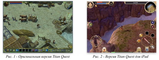
No matter what kind of hack'n'slash game you play, you always expect that the screen will be a multitude of items, spells, potions, weapons, Pets, etc., in short, anything interesting in this genre. The fact that in your journey each button has a clearly specified and important role. However, there is some complexity, because each player can customize your "buttons" depending on class and character development. On a PC this is done simply — the character moves with the mouse and keyboard keys to perform actions. But with the game on the touch screen the player has only the fingers! For convenience, people usually play with your thumbs rotated horizontally on a mobile device.
With this in mind, we can understand that the perfect venue for groups of the main action buttons will be the bottom of the screen. The upper part contains game information: HP and MP bars, character portrait, map, pause button, etc.
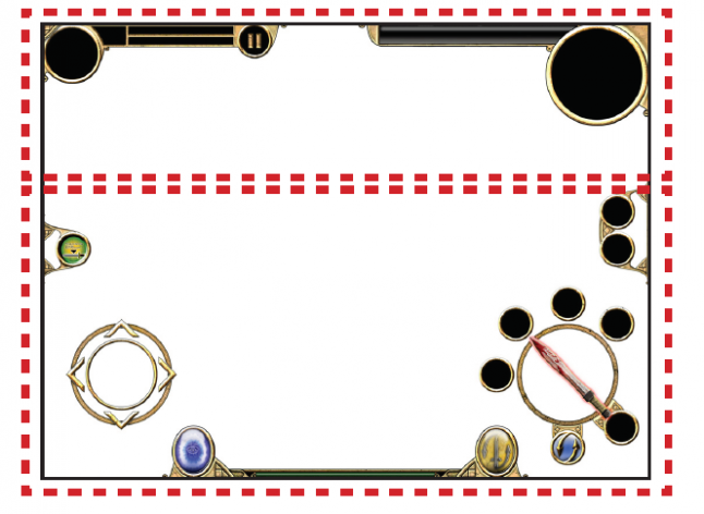
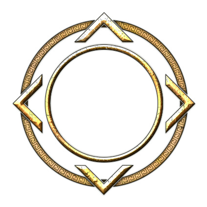
In addition, in a game like Titan Quest, moves the character by touching the screen is not applicable because the player's fingers should not cover the playing field. Instead, the thumbs of the player are constantly "glued" to the screen to move the character and activating actions. Here is an ideal choice has become a virtual joystick. It is well-known players, such a device we built in a lot of our games, because it doesn't take up much space. And, of course, the interface needs to be narrow enough so as not to reduce visibility.
In Titan Quest most often used buttons for spells, weapons, potions and portal teleportation. That's why I put them so that they were easily accessible and to reduce the distance that fingers move across the screen.

I placed the button of the portal and the button raising/display the loot on the left, next to the virtual joystick. This allows the player to run over objects on the ground and easy to pick them up. In addition, the unavailability of this button in battle allows a character to pick up items when he should be attacking. These buttons are not required in battle, besides, the fingers of the player are always next to the virtual joystick.

Are four spells, each of them can be set by holding for two seconds the desired button. Open the drop-down menu of available spells. Referring to the right spells, you can configure the button. Under the terms of the action is the button switching spells. In Titan Quest are available an impressive number of spells, so we didn't want to restrict players by only four. Instead, I created two sets of four spells (in the set But are spells 1-4, but in set B 5-8). Press the button to switch spells, the player can switch between sets A and B.
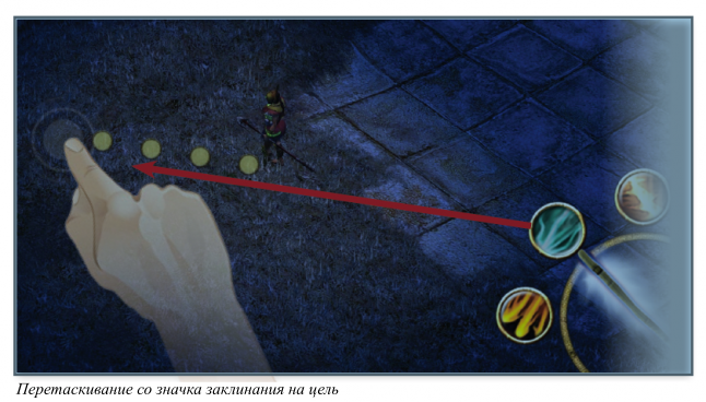
During development we had a related problem spells: some spells are focused on one enemy, while others affect the region. On a PC, the player simply needs to click on the spell icon, point the cursor and left button to activate the spell. But for the touch screen this is not an option. For example, if you activate the spell you need to touch the icon, and then the enemy or region, how to undo it? So we came up with for spells, a different approach: just drag the spell icon from the "throws" it on the enemy or area. Besides, for easy aiming we have added the dotted line showing the player where he is aiming. Some of the fights are pretty intense, so we added the effect of slow motion when aiming.
"Spell weapons" is another button under circle actions. It allows the player to assign a permanent spell for your chosen weapon. This gives the player a permanent spell weapons, not just the base attack but it costs mana. When the mana bars are empty, the spell weapon turns back into a basic attack. In the right part of the screen, above the circle of action shows the elixirs and their number. We have added a enabled by default setting automatically use potions when the player's health drops to a certain level.
At the bottom of the screen between the button of the teleportation portal and a button to switch weapons (as in the PC version, it allows you to switch between the first and second arms) is the scale of the experience. It shows how the player is close to the next level.

the
creating a new interface, preserving the original elements and style
When creating all these new buttons and elements which were absent in the PC version, I was inspired by the artistic style of Titan Quest. I used ochre, sand and stone, and the shape of the interface resemble ancient arabesques. To improve the clarity and quality has been redesigned some icons for example the buttons switch weapons and teleportation.
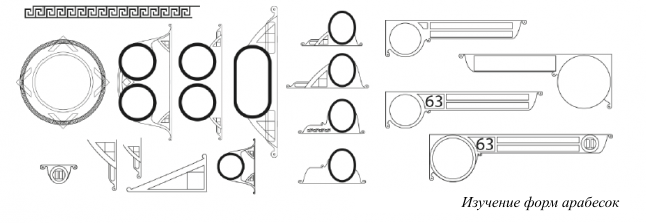
I've also created various icons for a range of actions that the player received clear feedback from each action that you selected. Therefore it was necessary not only to create an icon for each type of weapon (swords, bows and staffs), but also two kinds of proposed actions: the icon of the raising/interaction and icon dialogue with the NPC. While working on the last two actions I was inspired by the art of Ancient Greece, and especially the drawings of people on the frescoes and cups, which often represented the black pieces with the contour of ochre.

the
Adaptation of screens
Screens inventory, skills and quests, too, have undergone adaptation. In the PC version these screens open in separate Windows, and the game doesn't stop when they are open. But for adaptation to mobile devices we decided to make the window full screen and pause the game in the background. Accordingly, it was necessary to reconfigure the elements of each of the screens, because we wanted to display the same amount of information as the screens PC. For example, we chose the drop-down window to display all statistics of the player. In the PC version, it is displayed in two separate tabs. To manage items in the inventory in the PC version used a simple drag'n'drop, and to assign subject of "active equipment" (set 1 or 2), and to be discarded. The touch screen allows you to use the same approach. For throwing items, I created a simple box of "garbage".

Another innovation of these screens is the ability to switch between them without returning to the main screen. I've added to each screen three icons from the original game. This simple menu is always displayed in one place, allows players to switch between screens. I redrew these icons in the style of the original, but in higher resolution.

Finally, to control screen "skills" I adapted the system of "points" because the system on the PC was too small and difficult to use. By adding at the bottom of the screen distribution module points the player can quickly increase the level of spells that he wants to use. Everything related to the skills icons are also redesigned to better look selected and unselected items. Screen quests and maps were simple enough to be rebuilt.
Module distribution points added to the screen "skills" mobile version

the
New icon
We now turn to one of the most important elements of mobile game: the main icon.
When the game Titan Quest has been released on PC, the icon was only visible on the desktop. But in today's smartphone market is easily visible and quickly recognizable icon critical — mainly to stand out from the millions of apps and games that have flooded the virtual stores of iTunes and Google Play.
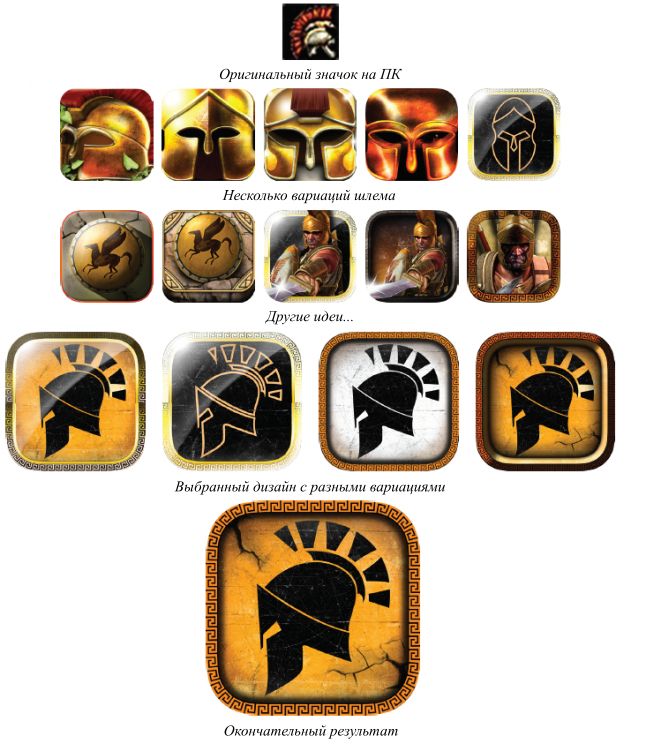
I thought the Spartan helmet would be a good choice for the icon, because it matches the icon on the PC. After many iterations I finally chose the icon is very similar to the ancient Greek image. Helmet highly stylized, icon combines the black color of the background, similar to cracked light-ocher wall. Also, the icon is framed by a pattern of repetitive geometric patterns typical of that period.
So, what I learned while working on Titan Quest? A lot: I learned that although the adaptation of computer hack'n'slash to mobile devices is challenging, it is really exciting. Dive into the already existing style of course limit my design capabilities, but also helped to expand the boundaries of my creativity. It helped to create a more accurate and significant results, compared to working from scratch.
Also I realized on a new platform, you can add a lot of new details and ideas, at the same time retaining a unique game experience such famous games like Titan Quest. You need to make every effort to ensure the familiarity of gameplay for players on PC. But at the same time you want to create a unique and modern gaming experience for new players.
This game greatly increased the collective experience of each employee DotEmu. The fundamental stages of the design, improved us when porting this game laid a solid Foundation for future PC games, which we will adapt for mobile devices.
Комментарии
Отправить комментарий